
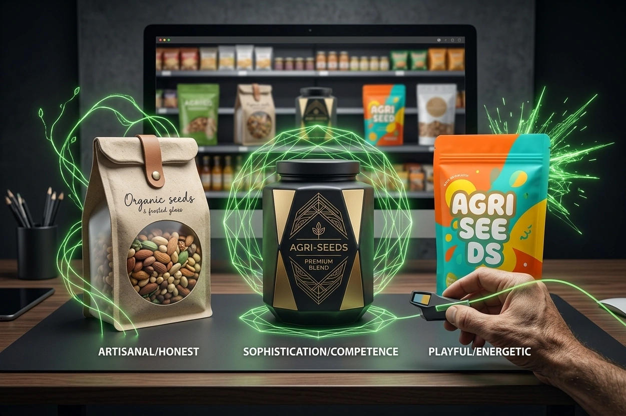
Imagine three packages containing essentially the same type of food product.
The first uses bright colors, rounded forms, friendly typography and energetic imagery.
The second relies on restrained colors, refined type, generous space and a matte finish.
The third uses earthy tones, ingredient photography and a simpler, more natural-looking design.
Even before reading the product names, you have probably formed different impressions of them.
The first may feel young, playful and energetic.
The second may appear sophisticated, premium or professional.
The third may seem natural, honest or artisanal.
In other words, packaging has already given each product a personality before the product itself has had a chance to speak.
This matters particularly in food and agriculture.
Before shoppers can taste, smell or experience the product, they need to make part of their judgement from what they see and handle on the shelf.
So the important question in packaging design is not simply:
“What does this product look like?”
A deeper question is:
“What kind of personality does this product develop in the shopper’s mind?”
What Do We Mean by Product Personality?
When we talk about product or brand personality, we are not suggesting that a package literally has human characteristics.
We are referring to the human traits people naturally use when describing brands.
A food brand, for example, may be perceived as:
honest, innovative, creative, serious, simple, joyful, traditional, bold, calm, sophisticated or trustworthy.
A 2025 study involving 510 food-industry consumers developed and tested a brand-personality scale specifically for food brands. Among the major dimensions identified in the study were characteristics associated with being innovative, creative, honest and resilient.
Those dimensions should not be treated as a fixed template for every brand or market.
The more important point is that consumers do, in fact, interpret food brands through personality-like characteristics.
And packaging is one of the strongest tools through which those characteristics are communicated.
1- Packaging Is the Product’s Silent Introduction
Imagine encountering a brand for the first time.
You have never seen its advertising.
Nobody has recommended it to you.
You know nothing about the company.
On the shelf, your first source of information is the product itself and the package surrounding it.
Color, shape, imagery, typography, material and composition begin sending signals immediately.
Those signals may lead you to think:
- This looks like a product for children.
- This seems healthy.
- This probably costs more.
- This feels traditional.
- This looks highly processed.
- This seems like a small local brand.
- This feels contemporary.
Research into packaging and brand image consistently shows that consumers do not evaluate packaging only in terms of whether it is attractive.
They use it to build broader impressions of the brand and of the experience they expect from the product.
Packaging is therefore not a neutral container.
It becomes part of the story shoppers construct about the brand.
2- In Food, Personality Should Start With the Truth of the Product
This is where food packaging becomes more challenging than many other forms of product design.
A food package communicates not only what the brand represents.
It also makes promises about something that will eventually be eaten or drunk.
Imagine packaging that feels soft, light and delicate.
It suggests:
“What is inside is mild, natural and gentle.”
But the actual product is intense, spicy and heavy.
Or imagine a dark, aggressive and serious package surrounding something light, sweet and playful.
Either design might look good when viewed independently.
But the relationship between the packaging personality and the actual product experience is wrong.
Research published in the Journal of Business Research in 2023 suggests that consumers can make associations between particular brand-personality characteristics and taste. Across four studies, including one involving a real brand, perceived sincerity showed a consistent association with sweetness, and greater congruence between taste and brand personality influenced evaluations.
That does not mean “sincere brands should taste sweet.”
The broader principle is more useful:
Consumers do not experience brand personality and product characteristics as entirely separate things.
If the two communicate conflicting messages, even an attractive package can create the wrong expectation.
Packaging development should therefore begin with the product itself.
- What does it taste like?
- What does it smell like?
- What is its texture?
- When is it consumed?
- What does it cost?
- Is the experience everyday or specialist?
- Functional or indulgent?
- Accessible or exclusive?
The packaging personality should continue that experience — not invent an unrelated one.
3- Desired Personality Is Not the Same as Perceived Personality
A branding team may say:
- We want to look modern.
- We want to feel premium.
- We want to be young and creative.
Those intentions are useful.
But intention does not guarantee perception.
A design that an internal team describes as “minimal and premium” may feel cold and impersonal to consumers.
Something intended to look “heritage and authentic” may simply appear old-fashioned.
A package designed to feel “young and playful” may be interpreted as childish or low-value.
This leads to an essential branding principle:
The company may define the intended personality, but the customer ultimately perceives it.
The role of design is to reduce the gap between the two.
That makes personality something that should be tested, not assumed.
If the intended personality is:
natural, contemporary and trustworthy,
show the package to representative shoppers without explaining the strategy first.
Then ask:
“Which three to five words would you use to describe this product?”
If the answers repeatedly include words such as:
“artificial,”
“overpriced,”
“old-fashioned,”
or “clinical,”
there is a problem — even if everyone on the design team loves the result.
4- Packaging Personality Is Not Created by One Element
As with packaging color, personality cannot be built by choosing a single visual device.
The elements need to work together.
In a widely cited series of studies published in the Journal of Marketing, Orth and Malkewitz examined how holistic package design affects brand impressions.
Across seven studies, they identified broad families of package design that created different personality perceptions. More natural-looking designs, for example, were associated more strongly with qualities such as sincerity, while high-contrast designs were more closely connected with excitement and ruggedness. More delicate compositions could support perceptions of competence or sophistication.
These findings should not be turned into mechanical rules.
The lesson is not:
“If you want sincerity, use this particular design style.”
The more valuable principle is:
Consumers read the package as a complete design system, not as a collection of isolated elements.
- Color,
- typography,
- shape,
- imagery,
- pack structure,
- surface finish,
- spacing,
- visual density,
- and even intentionally empty areas
all contribute to the tone of the product.
5- Shapes Can Give a Product a Different Character
Circles and angles are not merely geometric choices.
In food design, rounded and angular forms can create different expectations.
Research into predictive packaging design has found that rounded shapes, rounded typefaces and certain forms of naming can be associated more strongly with sweetness, while sharper forms may, in some circumstances, correspond more closely with sourness or sensory sharpness.
Another study examining food shape and typeface found that greater agreement between the physical form of the food and the style of its name could improve preferences, particularly for more indulgent products. Rounded foods paired with rounded typography, for instance, could create a more coherent impression.
More recent research has also found that a circular food logo can, under certain conditions, increase perceptions of freshness compared with a more angular logo.
But these effects should not be turned into universal rules.
Other research has shown that simple assumptions such as “round always equals sweet” do not hold consistently across every packaging context.
The correct approach is therefore to evaluate shape in relation to:
the product, the category, the typography, the color system and the intended brand personality.
Not in isolation.
6- Typography Is the Product’s Voice
Sometimes the personality of a package can shift significantly without changing its color or overall structure.
Typography alone can change the tone.
Compare:
a heavy, sharply angled typeface,
a soft handwritten style,
and a highly controlled geometric font.
All three could spell exactly the same product name.
They would not communicate the same personality.
A Food Quality and Preference study involving 1,718 participants demonstrated that the shape of typefaces can even influence perceptions of cultural origin.
In other words, letterforms can communicate meaning beyond the literal words they display.
A more recent 2026 study on packaging for local food products also found that handwritten typography could strengthen perceptions of fit with local provenance and affect how consumers processed information from the package.
For food and agricultural brands, this matters greatly.
A saffron brand,
a specialty coffee,
a locally produced food,
a contemporary ready meal,
and a children’s snack
should not automatically speak in the same typographic voice.
Typography should be part of the product personality — not merely a tool for displaying its name.
7- Materials and Finishes Also Have a Personality
A matte pack and a glossy pack can feel very different even when the printed artwork is identical.
Raw cardboard does not communicate the same thing as highly polished plastic.
Rough, soft, transparent, metallic, matte and glossy materials all contribute to how a product is interpreted.
Research comparing matte and glossy packaging, including coffee packaging, has shown that surface finish can affect brand impressions, product liking and purchase intention. Related research has also linked matte finishes with stronger perceptions of naturalness in certain settings.
A 2024 study examining food packaging materials found that products in paperboard packaging could be perceived as more sustainable and more expensive than comparable products in plastic packaging.
Even touch can influence the food experience itself.
Research published in Food Quality and Preference has found that package texture can alter expectations about the texture of the food inside.
That means material selection should not be based only on cost or printability.
Of course, food safety, preservation and technical performance come first.
But where several technically appropriate options exist, another question should be added:
“What does this material communicate about the character of the product?”
8- Sometimes Showing the Real Product Makes the Brand Feel More Honest
For many food and agricultural products, one of the strongest design choices is simply to let shoppers see what they are buying.
A transparent window revealing:
- grains,
- nuts,
- legumes,
- pasta,
- biscuits,
- dried fruit,
- or the actual food product
can communicate a very simple message:
“See the product for yourself.”
Research into transparent food packaging suggests that visibility can, in many categories, improve perceptions of freshness, quality and purchase appeal.
A 2026 study across seven experiments found that seeing a product through transparent packaging can also increase a sense of psychological connection or ownership and, under the right conditions, increase preference.
From a brand-personality perspective, transparency can support ideas such as:
simplicity, honesty, confidence in quality and product focus.
But transparency is not automatically right for every product.
If the product varies significantly in appearance, has inconsistent sizing, or requires a highly controlled premium presentation, showing the contents may work against the intended positioning.
The principle remains the same:
The personality of the pack needs to match the truth of the product.
9- Product Personality Can Also Say Something About the Person Buying It
This is one of the more interesting layers of packaging psychology.
People do not only form opinions about products.
They may also form opinions about the people who choose those products.
A cross-national study published in 2026 with 1,307 participants across Italy, Switzerland and the United Kingdom found that personality characteristics associated with a package or product could influence perceptions of its user.
Researchers described this as a form of trait transfer from the product to the person.
This is highly relevant to food brands because many food choices are not purely functional.
A consumer may choose a product because it fits the way they see themselves:
- someone who cares about health,
- someone interested in new experiences,
- a parent who pays close attention to family nutrition,
- someone who supports local producers,
- or a shopper who values premium and distinctive products.
The product therefore does not only communicate:
“This is what I am.”
It may also suggest:
“This is the kind of person who chooses me.”
That layer can be extremely valuable in positioning.
10- A Strong Personality Does Not Require More Design
A common mistake is assuming that a package needs more visual content to develop a stronger personality.
- More color.
- More copy.
- More imagery.
- More storytelling.
- More decoration.
But personality does not necessarily come from abundance.
People do not have a clear personality because they possess every possible trait.
They tend to be remembered through a smaller number of consistent characteristics.
Brands benefit from the same discipline.
Instead of defining ten personality traits, identify three primary ones.
For example:
- Natural
- Direct
- Contemporary
or:
- Bold
- Energetic
- Youthful
or:
- Authentic
- Warm
- Dependable
Then use those traits as a filter for every design decision.
- Does the color support them?
- Does the typography?
- Does the imagery?
- Does the material?
- Does the level of simplicity or complexity?
- Does the pack structure contradict them?
This turns brand personality into a design decision framework, rather than a list of adjectives in a strategy presentation.
11- Packaging Personality Needs to Scale
Food products rarely remain alone forever.
A brand may later introduce:
- new flavors,
- different sizes,
- complementary products,
- premium variants,
- value ranges,
- or even entirely new categories.
If brand personality depends too heavily on the appearance of one particular package, the system becomes difficult to extend.
Imagine a brand whose entire personality is tied to the pink color of a strawberry product.
What happens when the company later launches coffee, chocolate or a savory product?
The personality needs to exist at a deeper level than one color.
If boldness is a central characteristic, that quality can be expressed differently across different products.
If honesty sits at the core of the brand, it can be expressed through clear information, visible ingredients, straightforward language and a restrained photographic style throughout the portfolio.
Products can wear different clothes while still clearly belonging to the same family.
That is the basis of a scalable packaging system.
12- Established Brands Already Have a Personality
A new brand has considerable freedom to define its personality.
An established brand does not start from zero.
Customers have already formed an opinion.
The management team may describe the company as:
“young and creative.”
Customers may see it as:
“traditional, familiar and trustworthy.”
Neither perspective should simply be dismissed.
Before redesigning an established food brand, it is important to understand:
- How is the brand perceived today?
- Which parts of that personality are valuable?
- Which parts now limit growth?
- Which new characteristics need to be introduced?
- And how visible should the change be?
The goal of redesign should not be to erase the past.
It should build a bridge between the brand memory that already exists and the position the company wants to occupy in the future.
How to Define the Right Personality for Food Packaging
Rather than beginning directly with fonts and colors, use a more structured process.
Step 1: Describe the product before describing the packaging
If there were no package at all, what would define the product?
- Consider:
- taste,
- ingredients,
- production method,
- origin,
- price,
- usage occasion,
- quality,
- and the overall experience.
The personality should have a foundation in the product itself.
Step 2: Understand the shopper
- Who is the product for?
- What matters to this person when choosing?
- Are they looking for excitement or reassurance?
- Convenience or experience?
- Health or indulgence?
- Value or exclusivity?
A brand personality only works if it is meaningful to the people the brand wants to attract.
Step 3: Choose three core personality traits
Not ten.
Choose three characteristics that genuinely connect the product, the brand and the target shopper.
For example:
Honest. Natural. Contemporary.
Clarity forces better design decisions.
Step 4: Study competitor personalities
If nearly every competitor presents itself as “natural and calm,” creating another natural and calm brand may offer limited differentiation.
Look beyond colors.
Ask:
- Which brands feel playful?
- Which feel scientific?
- Which feel traditional?
- Which feel premium?
- Which feel bold?
- Which personality territory is already overcrowded — and where is there still room?
Step 5: Translate personality into a design system
Only now should the team begin asking:
- Which colors?
- Which typefaces?
- Which imagery?
- Which shapes?
- Which materials?
- How much simplicity or visual density?
Every decision should support the intended traits.
Step 6: Test the package without explaining it
Do not tell research participants:
“This brand is meant to feel natural and modern.”
Show them the packaging and ask:
“Which three words would you use to describe this product?”
The gap between the intended personality and spontaneous responses can be extremely revealing.
Step 7: Test the personality after product experience
Where possible, do not test the package only before consumption.
See whether the personality communicated by the design still makes sense after people have tasted or used the product.
If the pack promises one experience and the product delivers another, something needs to change.
Food Packaging Personality Checklist
Before approving a final design, ask:
- If this product were a person, which three traits would describe it?
- Do those traits come from the truth of the product, or only from what the marketing team wants to say?
- Will the target shopper identify with or respond positively to that personality?
- Are the color, typography, shape, imagery and materials communicating in the same direction?
- Does the packaging create the right expectations about taste, quality and product experience?
- If the brand name were temporarily removed, would the package still have a recognisable character?
- Is the personality meaningfully different from competing products?
- Can it extend into future products and categories?
- For an established brand, have valuable parts of the existing personality been protected?
- Has the intended personality been tested with real shoppers, or are we simply assuming it has been communicated?
If the first question produces five or six completely different answers within the brand team, the product personality is probably not yet clear enough.
Packaging Does More Than Show the Product, It Shapes Judgement
Consumers do not always wait for brands to explain themselves.
They use:
- color,
- shape,
- typography,
- materials,
- imagery,
- simplicity,
- surface finish,
- and dozens of smaller cues
to form an impression.
In food and agriculture, that impression becomes particularly important because packaging also creates expectations around taste, quality, freshness, origin and the overall consumption experience before the product has been tried.
That is why packaging design should not begin with:
“Which visual style looks best?”
A stronger starting point is:
“What is the real personality of this product, how should the shopper perceive it, and how can design bring those two things closer together?”
Once that question is clear, color, shape, typography and material stop being disconnected aesthetic decisions.
They become part of one coherent language.
A language that can tell the shopper, without a long explanation:
who this product is.
Sources
- Cruz-Tarrillo, J. et al. — Design and Validation of the Brand Personality Scale in Food Industries, Frontiers in Communication, 2025.
- Research involving 510 consumers examining how brand personality can be measured specifically within food industries.
- Orth, U. R. & Malkewitz, K. — Holistic Package Design and Consumer Brand Impressions, Journal of Marketing.
- A series of seven studies examining how complete packaging-design configurations influence brand impressions and perceived personality.
- Motoki, K., Nakahara, T. & Velasco, C. — Tasting Brands: Associations Between Brand Personality and Tastes, Journal of Business Research, 2023.
- Four studies examining the relationship between taste associations and brand-personality characteristics.
- Velasco, C. et al. — Predictive Packaging Design: Tasting Shapes, Typefaces, Names, and Sounds, Food Quality and Preference.
- Research investigating associations between shape, typography and sensory expectations such as sweetness and sourness.
- Li, S., Zeng, Y. & Zhou, S. — The Congruence Effect of Food Shape and Name Typeface on Consumers’ Food Preferences, Food Quality and Preference.
- Research examining how agreement between food form and typography can influence product preference.
- Celhay, F., Boysselle, J. & Cohen, J. — Research on Typeface Design and Food Packaging Communication, Food Quality and Preference.
- A large participant study examining how typography can influence meaning and perceived cultural origin in food packaging.
- Gong, X. et al. — The Shape of Freshness: The Effect of a Circular Logo on Consumers’ Perceived Food Freshness, Food Quality and Preference, 2025.
- Research examining how logo shape can influence perceptions of food freshness.
- The Influence of Material and Color of Food Packaging on Consumers’ Perception and Consumption Willingness, Food and Humanity, 2024.
- Research examining how packaging material and color influence perceptions of sustainability, healthiness and product value.
- Marckhgott, E., Kamleitner, B. & Estes, Z. — A Window of Opportunity: Transparent Packaging Affects Product Preference via Psychological Ownership, International Journal of Research in Marketing, 2026.
- Seven studies investigating how visibility through transparent packaging can influence psychological ownership and product preference.
- From Product to Person: A Cross-National Study on Packaging Personality and Consumer Stereotypes, 2026.
- A study involving 1,307 participants across Italy, Switzerland and the United Kingdom examining how perceived product and packaging traits can transfer to perceptions of the people who use them.