
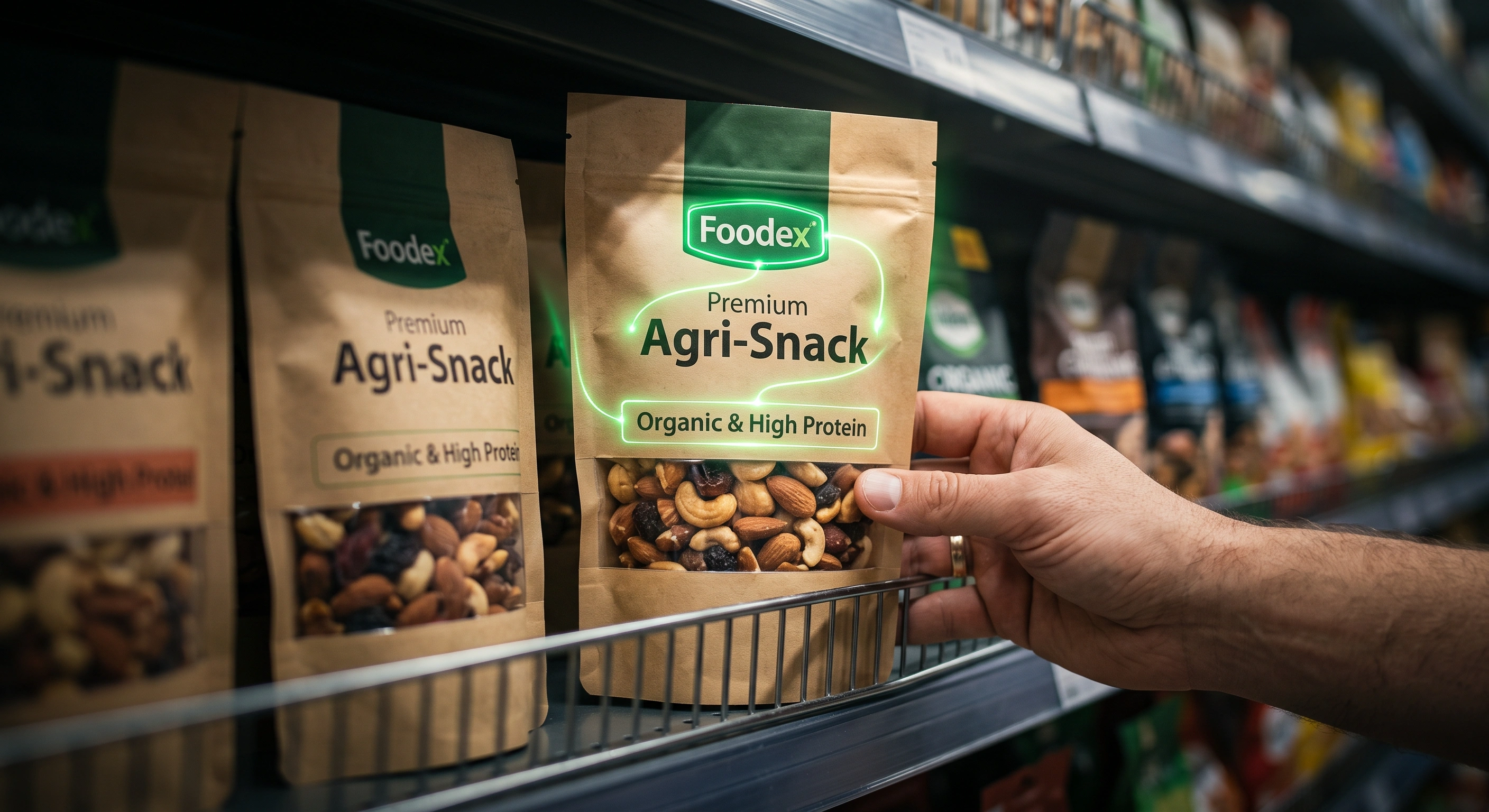
Imagine two food products with similar quality, pricing and purpose sitting side by side on a retail shelf. One quickly catches the shopper’s attention, communicates what it is and makes its way into the basket. The other, despite being a good product, may barely be noticed.
In that moment, packaging is doing far more than protecting what is inside.
Within a very short period of time, it needs to help a shopper understand:
What is this product?
Is it relevant to me?
How is it different from the alternatives?
And why should I choose it?
For food and agricultural products, this challenge is particularly demanding.
Consumers are not evaluating appearance alone. They bring expectations about taste, freshness, quality, ingredients, health, origin, portion size, usage and previous experiences with the brand.
NielsenIQ reported in 2026 that shoppers often spend only around 13 seconds looking at a product before making a decision. That narrow window places considerable pressure on packaging to attract attention, communicate quickly and make the decision easier.
The important question, therefore, is not:
“Does this packaging look good?”
A more useful question is:
“Does this packaging perform well in a real retail environment?”
Why Food Packaging Is Particularly Challenging?
A piece of consumer electronics or a decorative product may face a relatively defined set of expectations.
Food packaging often has to solve several problems at the same time.
It must protect the product, suit its physical characteristics, communicate necessary information, create appropriate expectations around taste and quality, and remain noticeable among a large number of competing products.
For some foods, the packaging must protect the contents from light, air or moisture.
For others, allowing shoppers to see the actual product through a transparent window may build confidence.
For an agricultural product, origin, naturalness or processing methods may matter.
For a snack, flavour and consumption occasion may be much more important.
Food packaging is therefore a constant balancing act between product protection, communication, expectation and commercial performance.
There is another challenge that becomes increasingly important as a brand grows.
The better the existing brand experience, the more carefully packaging changes must be handled
Consider a food brand that has delivered a consistently positive experience for several years.
Consumers may already recognise its colour palette, pack shape, logo, layout or even the location of particular elements on the front of the package.
At that point, redesigning the packaging is no longer simply about creating something new.
The challenge is to improve the pack without removing the visual signals consumers already use to recognise the brand.
Research into shopper attention has shown that brand familiarity and shelf position can influence both attention and choice. A study comparing consumer behaviour in experimental settings and on real supermarket shelves found that brand and product variety were among the factors shaping attention and selection.
NielsenIQ has made a similar observation in its analysis of successful packaging redesigns: strong redesigns improve clarity, shelf visibility and differentiation while preserving important brand assets that shoppers already recognise.
For an established food brand, redesign can therefore be more difficult than designing for a new brand.
The task is not simply to change.
It is to move the brand forward without erasing the memory it has already built.
What Does Retail Readiness Mean?
In this article, retail readiness refers to whether a product’s packaging is genuinely prepared for the conditions in which it will be sold.
A design should not only look impressive on a designer’s screen or in a presentation.
It needs to work in the store.
Retail-ready packaging should help a product:
- stand out among comparable products;
- communicate what the product is quickly;
- keep the brand recognisable;
- differentiate flavours, varieties or formats;
- present key information in the right order;
- work within the physical constraints of the shelf;
- fit professional retail merchandising systems;
- and ultimately make the shopper’s decision easier.
Seen this way, packaging is no longer simply a printed surface.
It becomes one of the main points of interaction between the product, the brand, the retailer and the shopper.
1- Louder Packaging Does Not Necessarily Get More Attention
A common assumption is that stronger shelf presence comes from using more colour, larger typography, more imagery or additional graphic elements.
Shopper attention does not work that simply.
Research published in the Journal of Business Research, examining 158 consumer product packages, found that factors such as visual salience, element size and placement can influence how much attention particular parts of a package receive. Brand-related elements were also generally presented more prominently than some other types of information.
Another eye-tracking study involving frozen food packaging found that even the position of the product image, brand mark and flavour information could change where consumers directed their attention.
The objective, therefore, is not to make every element dominant.
It is to guide the shopper towards the right information in the right sequence.
When everything on the pack demands attention at the same time, the result may not be greater impact.
It may simply be greater confusion.
2- Shoppers Need to Understand the Product Quickly
One of the first responsibilities of packaging is to make the nature of the product clear.
This becomes even more important for new brands.
An established brand benefits from previous familiarity. A new entrant does not.
Within the first few seconds, a shopper should ideally be able to answer questions such as:
What is it?
Which category does it belong to?
What is distinctive about it?
Which brand makes it?
Which flavour, variety or format am I looking at?
If a shopper needs to pick up the package and carefully search across several areas before understanding these basics, unnecessary friction has already been introduced into the decision.
Research by Bialkova, Grunert and van Trijp, comparing attention in controlled environments with behaviour at a real supermarket shelf, found that brand and product variety were among the important drivers of attention and choice.
A useful packaging test is therefore remarkably simple:
Can someone who has never seen the product before understand what it is within a few seconds?
3- Information Hierarchy Matters More Than Information Volume
Food packaging often needs to carry a substantial amount of information:
the brand, product name, flavour, weight, product benefits, ingredients, nutrition information, claims, usage instructions and legally required statements.
Including all necessary information does not automatically mean the package communicates effectively.
The shopper needs to understand:
what to notice first,
what to understand next,
and what to explore only if more detail is required.
For many products, the hierarchy might resemble:
Brand → Product Type → Variety or Flavour → Main Reason to Choose → Supporting Information
But there is no universal order.
The correct hierarchy depends on the product category, market, brand positioning and shopper priorities.
On a sports nutrition product, protein content may deserve immediate visibility.
On an organic product, provenance or production method may carry more weight.
For olive oil, the type of oil and its origin may matter more than an advertising message.
Professional packaging design therefore should not begin with:
“Which line of text should we make bigger?”
It should begin with:
“What does the shopper need to understand first in order to make a decision?”
4- A Pack Needs to Be Distinctive Without Becoming Unrecognisable
Over time, most food categories develop their own visual language.
Walk through a supermarket and look at:
coffee, dairy, breakfast cereals, honey, protein products, energy drinks or baby food.
Each category tends to develop patterns in colour, imagery, typography, materials and pack structure that help shoppers identify the type of product quickly.
This creates an important strategic tension.
If your packaging looks too similar to competitors, the brand can disappear into the category.
If it moves too far away from familiar category signals, shoppers may struggle to understand what the product is.
The goal is therefore not differentiation at any cost.
Good packaging should be:
familiar enough to be understood quickly,
yet distinctive enough to be remembered.
This balance deserves its own discussion. In the next article in this series, we will examine why certain colours repeatedly appear within specific food categories — and when breaking those conventions can strengthen a brand rather than weaken recognition.
5- Design the Pack for the Shelf, Not Just the Screen
One of the most common risks in packaging design is making final decisions based only on the artwork file.
A designer may review the packaging at a large scale on a high-resolution monitor.
A shopper experiences it very differently.
They may see the product:
from several steps away,
under supermarket lighting,
surrounded by dozens of alternatives,
next to price labels and promotional messages,
and sometimes with only part of the front panel fully visible.
Those two viewing conditions are not equivalent.
Packaging therefore needs to be tested in circumstances that resemble the real shopping environment.
Important questions include:
Is the brand still recognisable from a normal shopping distance?
Does the pack remain noticeable beside its three main competitors?
When several units are placed next to one another, do they create stronger brand presence?
Can shoppers distinguish different flavours or variants quickly?
Could shelf-edge pricing cover important information?
Would the product still be recognisable if placed on a high or low shelf?
The real buying environment should be part of the design process — not something the brand discovers after thousands of packs have already been printed.
6- Why Planograms Matter to Food Brands
Large retailers use planograms to organise products on shelves.
A planogram is essentially a merchandising map showing where products should be positioned, how much space they receive and how many units should face the shopper.
This is where standards such as GS1 become relevant.
GS1 is a global standards organisation that develops systems for identifying products and exchanging information throughout supply chains and retail environments. Its standards cover areas including product identification, data, imagery and information used by retailers.
GS1 specifications for planogram-related product images include information such as pack height, width and depth, helping retailers model shelf layouts and calculate how products fit within a given space.
For brands, this leads to an important conclusion:
Pack size and structure are not only production decisions. They are commercial decisions.
Two products containing nearly the same quantity may occupy very different amounts of shelf space.
An overly wide pack may reduce the number of product facings.
A structure with poor stability may make merchandising harder.
Important information placed too close to the sides may become less visible when several products are tightly arranged together.
Professional packaging development should therefore treat shelf geometry as part of the design problem.
7- “Retail-Ready Packaging” Also Has a Technical Meaning
There is an important distinction worth making.
Within the packaging industry, the terms Retail Ready Packaging and Shelf Ready Packaging are also used in a more specific technical sense.
GS1 describes retail-ready packaging as a form of secondary packaging that allows products to be presented for sale without store staff having to remove every individual item from its outer case.
Think of a display case containing multiple snack bars or confectionery packs. Store staff open or remove part of the outer carton, and the carton itself becomes the display unit on the shelf.
In this context, packaging has another user:
the retailer’s store team.
The secondary pack should therefore be:
easy to identify,
easy to open,
quick to place on the shelf,
easy for shoppers to purchase from,
and straightforward to remove or recycle when empty.
This highlights an important principle:
Food packaging is not designed only to look good.
It needs to work throughout the retail process.
8- A Product Range Needs a Packaging System
A familiar problem appears as food brands expand.
The first product launches.
Several months later, a second flavour is introduced.
Then another size appears.
A third product follows.
Eventually an entirely new category is added.
If every pack has been designed independently, the portfolio may begin to look like a collection of unrelated brands.
A good packaging system needs to accomplish two things simultaneously.
Create consistency
Shoppers should quickly recognise that the products belong to the same brand.
Make navigation easy
At the same time, they should be able to identify the flavour, variety, format or purpose they want without confusion.
This matters particularly in food and agriculture, where brands frequently extend their portfolios over time.
Packaging therefore should not be designed only for today’s product.
It should also create enough structure for tomorrow’s product family.
9- Do Not Destroy a Good Brand Experience in the Name of Redesign
This issue is particularly important in food.
Many food purchases are highly repetitive.
A shopper may buy the same product every week, or even several times a week. Over time, the package becomes part of the way they recognise and navigate the category.
They may not consciously read the full product name every time.
Instead, they may recognise a particular colour, logo, image, pack shape or overall arrangement.
A successful brand redesign therefore needs restraint.
The objective should not be:
“Change everything so the brand looks new.”
A better question is:
“Which cues do existing customers already use to recognise the brand, and which of those need to be protected?”
NielsenIQ’s 2026 review of Design Impact Award winners points to a similar pattern. Successful redesigns improved shelf visibility, clarity and brand differentiation while retaining the familiar brand assets consumers already knew.
This is one of the clearest differences between strategic redesign and cosmetic change.
A new design should not erase useful brand memory without a good reason.
10- Test Packaging Beside Real Competitors
A pack may look excellent against a white background in a brand presentation.
That is not the real test.
The real test begins when the product is placed beside the alternatives a shopper will actually consider.
Before large-scale production, brands can test packaging through relatively simple methods:
placing printed mock-ups on a simulated shelf,
reviewing packs at actual size,
positioning them beside competitors,
checking them from different distances,
testing legibility,
and comparing alternative versions with potential shoppers.
Larger projects can add eye-tracking, choice testing, three-dimensional shelf simulations and behavioural research.
The value of these approaches is straightforward:
the final decision is not based solely on the personal preferences of the designer, brand manager or business owner.
Eye-tracking research has demonstrated that even changing the position of design elements can alter where shoppers look — something that is not always obvious when viewing a package by itself.
Can Better Packaging Really Increase Sales?
This is where brands need to separate evidence from marketing exaggeration.
Packaging cannot compensate for poor product quality, inappropriate pricing, weak distribution or unclear positioning.
But it can make the buying decision easier or harder.
In August 2026, NielsenIQ published findings based on almost a decade of winners from its Design Impact Awards. The selected packaging redesigns were associated, on average, with approximately a 4% increase in sales volume.
That figure needs to be interpreted carefully.
It does not mean:
“Redesign your packaging and sales will automatically increase by 4%.”
The more useful finding is that packaging redesign, when informed by evidence, shopper understanding and real-world testing, can create measurable commercial impact.
According to NielsenIQ, successful redesigns tended to share characteristics such as:
stronger shelf visibility,
clearer information hierarchy,
simpler communication,
better brand recognition,
and easier shopper choice.
The commercial value of packaging therefore lies not in how much it changes.
It lies in how effectively it improves the buying experience.
So, What Kind of Food Packaging Is More Likely to Be Chosen?
The answer is not “red packaging”.
It is not “minimalist packaging”.
And it is not “use a large image of the product”.
There is no single visual formula that works across every food category.
A package is more likely to perform well when it can:
be noticed,
be recognised,
be understood quickly,
create the right expectation of the product,
make the reason to choose clear,
remain distinctive beside competitors,
respect valuable brand memory,
work properly within the shelf environment,
and make the purchase decision easier.
That is the difference between packaging that looks attractive and packaging designed to perform commercially.
Food Packaging Retail-Readiness Checklist
Before approving the final packaging design, ask at least these ten questions:
- Can shoppers still recognise the brand from several steps away?
- Can someone understand what the product is within a few seconds?
- Is the main reason to choose the product clear?
- Can shoppers quickly identify the flavour, variety or size they want?
- Does the pack remain distinctive beside its real competitors?
- Has the redesign preserved valuable and familiar brand cues?
- Does the product range feel consistent while remaining easy to navigate?
- Are the pack dimensions and structure appropriate for the real shelf environment?
- Will the most important information remain visible under realistic merchandising conditions?
- Has the package been tested on a real or simulated shelf before large-scale production?
If several of these questions cannot yet be answered confidently, the design is probably not ready for final production.
Food Packaging Is More Than the Surface of the Product
Packaging is one of the places where the product, shopper experience, brand identity and retail reality meet.
In food and agriculture, that relationship is particularly sensitive because consumers are not simply evaluating appearance. Packaging also shapes expectations around quality, taste, freshness, health and the experience they have previously had with the brand.
That is why the final question in a packaging project should not be:
“Is this design attractive?”
It should be:
“For which product, which shoppers, which competitors, which retail environment and which buying behaviour has this package been designed?”
When those questions become part of the design process, packaging stops being merely a graphic output.
It becomes part of the product’s real readiness for the market.
Sources
NielsenIQ — Packaging That Wins: Proven Principles to Maximise Your Pack Performance, 2026.
Referenced for shopper decision time and the role of packaging in attention, recognition and choice.
NielsenIQ — Packaging Redesigns See 4% Average Volume Lift, 2026.
Referenced for the commercial results associated with Design Impact Award winners and recurring characteristics of effective packaging redesigns.
GS1 — Product Image Specification Standard.
Referenced for product imagery, planogram applications, product dimensions and the technical concept of retail-ready packaging.
Orquin et al. — The Visual Ecology of Product Packaging and Its Effects on Consumer Attention, Journal of Business Research.
Referenced for research into the size, placement and visual prominence of packaging elements and their relationship with consumer attention.
Barbosa, de Moura & de Medeiros — Positioning of Design Elements on the Packaging of Frozen Convenience Food, Food Quality and Preference.
Referenced for eye-tracking research on the placement of product imagery, branding and flavour information on food packaging.
Bialkova, Grunert & van Trijp — From Desktop to Supermarket Shelf: Eye-Tracking Exploration on Consumer Attention and Choice, Food Quality and Preference.
Referenced for research comparing shopper attention and choice in controlled environments and real supermarket conditions.