
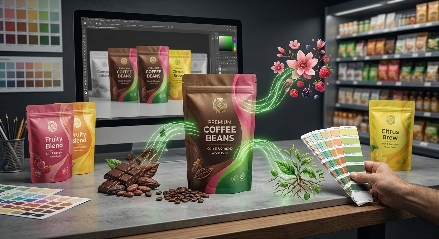
Before a shopper reads the product name, checks the ingredients, or considers the claims on a package, there is a good chance they have already noticed its color.
That first impression can communicate more than we may realize.
Does the product feel indulgent or healthy? Familiar or different? Natural or highly processed? Affordable or premium? Does it even look like the type of product the shopper is looking for?
This is where one of the most common mistakes in food packaging begins.
Color decisions are often reduced to oversimplified rules:
Green means healthy.
Red stimulates appetite.
Black means premium.
Blue communicates trust.
In reality, color does not work through a universal dictionary.
Research in food and beverage packaging shows that color can influence expectations around taste, sweetness, bitterness, freshness, healthiness, flavor intensity, naturalness and even product type. But those associations depend on the product category, the shade and intensity of the color, other packaging elements, previous consumer experience and, in some cases, cultural context.
So the right question for a food brand is not:
“Which color sells best?”
A much more useful question is:
“What does this color already mean to shoppers in our category, and when should our brand follow those expectations or deliberately challenge them?”
Why color matters more in food packaging
In many product categories, color is primarily part of the product’s appearance and brand identity.
In food, it does something else as well:
It helps consumers imagine an experience that has not happened yet.
A shopper has not tasted the coffee while looking at the pack.
The chocolate has not been opened.
The aroma of the tea, texture of the cereal, sweetness of the honey or freshness of an agricultural product has not yet been experienced.
The shopper therefore relies on cues from the packaging to make predictions about what is inside.
Color is one of the fastest of those cues.
A 2025 study involving 238 specialty coffee consumers found that simply changing the color of the package influenced expectations about sweetness, bitterness, roast level, aroma, flavor and even broader product characteristics such as whether the coffee appeared modern or organic.
Pink packaging, for example, was more strongly associated with sweetness and floral or fruity characteristics, while brown packaging was associated more with bitterness, darker roasting, stronger aromas and cocoa notes. Green also strengthened associations with organic positioning.
The important lesson is not that particular colors should always be assigned to particular flavors.
It is this:
Color can begin telling a story about the product before the first sip or bite.
If that story does not match the actual product experience, packaging can create the wrong expectation instead of supporting the product.
1- Every food category gradually develops its own color language
Walk through several supermarkets and ignore the brand names for a moment.
Look only at the colors.
You will probably begin to notice patterns.
Different food categories gradually develop recurring combinations of color, imagery, typography and packaging structure. These conventions are not necessarily created by an official rulebook.
They develop through repetition.
Brands use certain colors.
Shoppers repeatedly encounter them.
Connections begin forming between those colors and particular products, flavors or product attributes.
Competitors then adopt similar cues, and over time a recognizable category language emerges.
In a particular market, shoppers may learn to associate one color with a certain flavor, fat level, product type or functional benefit.
These learned conventions have an important commercial advantage:
They make recognition faster.
A consumer does not need to read every word on every package. Familiar visual cues allow part of the product information to be processed almost immediately.
That efficiency matters on a crowded food shelf.
2- Category color conventions are not universal rules
This is where many simplified articles about the “psychology of color” become misleading.
The same color can mean very different things in different food categories.
A scientific review of packaging design and food experience, for example, notes that green can trigger different flavor expectations depending on context. In some products it may suggest mint; in others, lime or another ingredient.
Even colors that seem strongly associated with a particular characteristic do not always produce the same response.
A 2021 study involving 420 participants in France and Brazil examined how seven packaging colors affected expectations of chocolate.
Across milk and dark chocolate, black packaging was associated with greater expected bitterness, while pink and yellow were associated with greater sweetness.
But the same black package did not affect liking in the same way for milk and dark chocolate.
The product itself changed the meaning of the color.
So a statement such as:
“Black is the right color for premium products.”
is not a packaging strategy.
The real questions are:
- Black for which product?
- In which market?
- Beside which competitors?
- And within which existing consumer expectations?
3- Sometimes brands create the color rules themselves
Not every color association comes from the wider category.
Sometimes a brand repeats a color system so consistently that consumers learn it.
A well-known study on potato-chip packaging in the UK provides a useful example.
Researchers examined associations between packaging colors and different flavors. Participants responded more slowly and made more mistakes when they encountered unexpected combinations of color and flavor.
But there was an important detail:
Their expectations were strongly influenced by the brands they normally bought.
In other words, repeated experience with particular brands had trained consumers to associate certain colors with certain flavors.
This has major implications for established food brands.
If customers have spent years learning that:
blue means one variety,
green means another,
and red signals a particular flavor,
those colors are no longer simply design choices.
They have become part of the shopper’s buying memory.
Changing them without research can make a familiar product harder to find, or even create the impression that the product itself has changed.
This is one reason redesigning the packaging of a successful food brand often requires more care than designing packaging for a completely new one.
4- Why follow category colors at all?
If differentiation is important, a reasonable question follows:
Why should a brand look anything like its competitors?
Because familiarity is sometimes useful.
A completely new brand does not yet benefit from memory.
The shopper does not recognize its name.
Its visual identity carries no previous associations.
In that situation, familiar category cues can help shoppers understand the product faster.
They may communicate:
- what kind of product it is,
- what kind of experience to expect,
- and roughly where it belongs within the market.
Research published in 2023 examining packaging color and food type found that greater congruence between packaging colors and existing expectations about a type of food could make product information easier to process and influence purchase intention.
The study found stronger responses when warm colors were used for more indulgent food types and cooler colors for products positioned more strongly around health.
This does not mean all healthy products should be blue or green.
The more important principle is:
When packaging cues match what consumers already expect, the product can become easier to understand.
That processing advantage can be valuable, particularly for an unfamiliar brand.
5- When should a brand break the category color rules?
If every product in a category uses the same visual language, the shelf can become remarkably repetitive.
This creates an opportunity.
A brand that moves away from the dominant color convention may become easier to notice.
But there is a major difference between strategic disruption and being different for the sake of being different.
Breaking a category convention is more likely to make sense when:
The category looks overwhelmingly similar
If most competitors use nearly identical color combinations, there may be room to establish a distinctive visual territory.
The brand has a clear reason to be different
A new color should connect to the positioning, product, personality and promise of the brand.
It should not exist solely to attract attention.
Other packaging elements still communicate the category
If color moves away from familiar conventions, product naming, imagery, structure, typography and other cues need to work harder to ensure shoppers still understand what the product is.
The brand has the ability to build a new association
Strong brands — or brands with repeated customer contact — can gradually teach shoppers a new color meaning.
That is much harder for a completely unknown product with very little marketing support.
The principle is simple:
Breaking a convention works best when the brand has something meaningful to replace it with.
6- Good differentiation creates interest. Bad differentiation creates confusion
The line between the two can be surprisingly thin.
An unexpected package color may stop a shopper.
But if the person still cannot understand what the product is several seconds later, attention has not translated into progress towards purchase.
Shelf visibility is therefore only one part of the journey.
A more useful sequence is:
Notice → Recognize → Understand → Identify the Brand → Consider Choosing
If the package succeeds at the first stage but fails at the second, its unusual color has achieved very little.
The potato-chip study mentioned earlier illustrates this risk. When color-flavor combinations conflicted with participants’ learned expectations, product identification became slower and more error-prone.
So the objective is not for shoppers to think:
“That is an unusual color.”
It is for them to think:
“I noticed it, I understand what it is, and I am interested enough to look closer.”
7- Packaging color can change expectations of flavor
For food brands, this is one of the most important functions of color.
Just as an image of strawberries can create an expectation of strawberry flavor, packaging color can become a sensory cue before the product has even been opened.
Research has demonstrated these effects across chocolate, coffee, beverages, dairy products, snacks and other food categories.
The 2025 specialty coffee study provides a particularly useful example.
Pink packaging was associated more strongly with sweetness and floral or berry-like notes.
Brown was associated with stronger roasting, bitterness and cocoa.
Changes in color intensity and darkness also affected expectations of sensory characteristics.
For food producers, this leads to an important principle:
Packaging should not make a promise the product cannot deliver.
Imagine packaging that strongly suggests a light, sweet and fruity product, while the actual experience is dark, bitter and intense.
The problem is not simply visual.
The package has created an expectation that the product experience contradicts.
Professional color decisions should therefore begin with the product itself:
- What does it actually taste like?
- What does it smell like?
- What is its texture?
- How intense is the experience?
- Which part of that experience should the packaging communicate before purchase?
Color should support that answer.
8- Even “green means healthy” is more complicated than it seems
Green is widely used to communicate naturalness, plant-based positioning, environmental responsibility and health.
That familiarity can make green useful.
It can also make it predictable.
A 2024 study examining food packaging across several categories found that products presented in green packaging were generally perceived as healthier than the original versions. The study also found that packaging material itself affected perceptions of sustainability and price independently of color.
There are two useful lessons here.
First, color can genuinely influence how shoppers interpret a product.
But second:
Color cannot replace the reality of the product.
If a product has no meaningful health, ingredient, origin or sustainability proposition, simply adopting the visual language of “healthy” brands can create a vague or misleading message.
There is also a competitive issue.
If almost every “natural” brand in a category uses green, choosing the same green may place your product directly into the most visually crowded part of the category.
Sometimes the better question is not:
“Which shade of green should we use?”
It is:
“Can naturalness be expressed in another way that is more distinctive to our brand?”
9- Never evaluate color separately from the rest of the packaging
A real package is not a single block of color.
Color works together with:
- typography,
- product photography,
- illustration,
- pack shape,
- materials,
- gloss or matte finishes,
- negative space,
- the brand mark,
- secondary colors,
- and the overall composition.
Research published in 2025 examining color-typeface congruence found that product evaluations improved when the two design cues communicated more compatible impressions.
This reinforces an important principle:
Consumers do not experience individual design elements independently.
The same shade of green can communicate something very different when combined with delicate typography and botanical imagery than when paired with heavy lettering, metallic materials and a black background.
So instead of asking only:
“What is our brand color?”
a better question is:
“What overall impression does our color and design system create?”
That is a much more useful foundation for packaging decisions.
10- In a product family, color should help shoppers navigate
Food brands rarely remain single-product businesses.
Over time, they add:
- new flavors,
- new sizes,
- different formulations,
- and sometimes entirely new product ranges.
- Color then takes on another important role:
- navigation.
Consider a brand offering six drink flavors or eight snack varieties.
If the colors are too similar, shoppers may struggle to find the variant they want.
If every product uses an entirely unrelated color system, the portfolio can lose its family resemblance.
A strong packaging system therefore needs to balance two needs:
Brand consistency
Customers should immediately recognize that the products belong together.
Fast differentiation
They should also be able to distinguish flavors, varieties or formats without unnecessary effort.
This needs to be planned before the range becomes large.
If every new product gets a color based only on the preferences of that individual project, the portfolio can quickly turn into an inconsistent collection with no clear system.
Color strategy should therefore consider not only the product being launched today, but the products that may be added tomorrow.
11- A color that works in one market may not work the same way in another
Color is also shaped by culture.
Its meaning can develop through language, traditions, food habits, dominant local brands and previous consumer experience.
Interestingly, the France-Brazil chocolate study found relatively limited differences between the two groups for several of the tested associations. But both that study and broader research on packaging make an important point:
Color associations can still be influenced by cultural and learned experience.
For food and agricultural brands entering export markets, this matters considerably.
A color system that feels obvious and familiar in the domestic market should not automatically be assumed to communicate the same message abroad.
This can be particularly important for products such as:
- tea,
- coffee,
- spices,
- dates,
- saffron,
- honey,
- nuts,
- oils,
- dairy products,
- and culturally specific food categories.
In these markets, competitors may have established completely different color conventions.
Color research therefore needs to be conducted within the market where the product will actually compete.
12- Test packaging color on the shelf — and on the digital shelf
As with retail readiness more broadly, one principle is essential:
Do not judge packaging color only inside a design file.
A color may look distinctive on a large monitor and disappear completely when placed beside ten similar products.
The reverse can also happen.
A color that initially feels unusually bold in isolation may become exactly the amount of differentiation the brand needs once it enters the real category.
Before final approval, the package should ideally be tested:
beside its main competitors,
at actual size,
under realistic retail lighting,
from normal shopping distances,
and as a small product image in an online store.
That last point is increasingly important.
Food products now compete not only on physical shelves, but on small mobile screens where several product images may appear at once.
The color system needs to work in both environments.
A strong package should remain identifiable whether a shopper encounters it from two metres away in a supermarket or as a small thumbnail on a phone.
How to Choose the Right Color for Food Packaging
Instead of starting with a generic “color psychology” chart, a more rigorous process begins with the product and the market.
Step 1: Start with the product
What are the real characteristics of the product?
Consider its:
- taste,
- aroma,
- texture,
- ingredients,
- origin,
- quality,
- processing method,
- and overall consumption experience.
The packaging color should not tell a completely different story.
Step 2: Study the shelf
Which colors dominate the category?
What do the leading brands use?
Have certain colors become associated with specific flavors, formats or attributes?
Is the shelf visually consistent or highly fragmented?
This is the environment in which the brand must operate.
Step 3: Identify learned consumer cues
Does the shopper rely on color to distinguish:
- flavor,
- fat content,
- processing method,
- product variety,
- origin,
- or another characteristic?
If so, breaking those cues needs to be intentional.
Step 4: Decide where familiarity is useful
Not every convention needs to be challenged.
Identify which familiar category signals help consumers understand the product quickly.
Keep them when they serve a purpose.
Step 5: Define where the brand should be different
The brand needs its own visual territory.
Differentiation may come from:
the primary color,
a secondary color,
the proportion in which colors are used,
typography,
graphic structure,
pack materials,
or a combination of several elements.
Color does not have to carry the entire burden of differentiation.
Step 6: Design for the future product family
If four more varieties are launched next year, will the color system still work?
A packaging system needs enough flexibility to grow.
Step 7: Test before committing
Evaluate the design beside competitors, at real size and, where possible, with representative shoppers.
Color should not be approved only because the internal team likes it.
Food Packaging Color Checklist
Before approving the final color system, ask:
- What expectation does this color create about taste and product characteristics?
- Does that expectation match the actual product experience?
- Which colors do shoppers already use to navigate this category?
- Does our package look too similar to competitors — or too unfamiliar for the category?
- If we have broken a color convention, do the other design cues still make the product easy to understand?
- Is this color already part of existing brand memory that should be protected?
- Can shoppers distinguish different flavors, varieties and sizes easily?
- Can the color system scale as the product portfolio grows?
- Does the chosen color communicate the intended meaning in the target market?
Has the package been tested beside real competitors and on the digital shelf?
If the strongest explanation for a color decision is:
“Because it looks good,”
or:
“Because healthy brands usually use green,”
the decision probably needs more work.
The Best Color Is Not Simply the One That Gets Noticed
Color can attract attention.
But its real value in food packaging lies in what happens after that attention has been captured.
- Does it make the product easier to understand?
- Does it create the right expectation of taste and quality?
- Does it help customers find the variety they want?
- Does it separate the brand from its competitors?
- And does the promise created by the packaging match the experience delivered by the product?
Sometimes the right decision is to follow an established category color.
Sometimes the right decision is to break it.
And sometimes the strongest strategy is to keep part of the familiar language while creating a distinctive new element of your own.
That is why professional packaging color strategy should not begin with:
“Which color sells more?”
It should begin with three questions:
- What does the shopper already understand from this color?
- What does the product genuinely need to communicate?
- And what association does the brand want to build over time?
At that point, color stops being a matter of taste.
It becomes part of the packaging strategy and the long-term positioning of the brand.
Sources
- Spence, C. & Velasco, C. — On the Multiple Effects of Packaging Colour on Consumer Behaviour and Product Experience in the Food and Beverage Category, Food Quality and Preference.
- A review of how packaging color can influence attention, taste expectations, product perception and food experience.
- Carvalho, F. M. et al. — Packaging Colour and Consumer Expectations: Insights from Specialty Coffee, Food Research International, 2025.
- Research involving 238 specialty coffee consumers examining the effects of packaging color and color intensity on expected flavor, aroma, roast level and broader product associations.
- Baptista, I. et al. — Effects of Packaging Color on Expected Flavor, Texture, and Liking of Chocolate in Brazil and France, International Journal of Gastronomy and Food Science.
- A cross-country study involving 420 participants examining how package color influenced expectations of sweetness, bitterness and chocolate preference.
- Piqueras-Fiszman, B. & Spence, C. — Crossmodal Correspondences in Product Packaging: Assessing Color–Flavor Correspondences for Potato Chips, Appetite.
- Research exploring learned relationships between package color and flavor, including the influence of consumers’ previous experience with different brands.
- Huang et al. — Influence of Food Packaging Color and Food Type on Consumer Purchase Intention, Frontiers in Nutrition, 2023.
- Research examining the interaction between packaging color and food type, and its relationship with processing fluency and purchase intention.
- The Influence of Material and Color of Food Packaging on Consumers’ Perception and Consumption Willingness, Food and Humanity, 2024.
- Research examining how green packaging and packaging materials can influence perceptions of healthiness, sustainability and product value.
- Effects of Color–Typeface Congruence on Product Evaluation, Journal of Retailing and Consumer Services, 2025.
- Research examining the relationship between color and typeface compatibility and its effect on product evaluation.